Our research into hotel guests’ online behaviour shows that alarmingly often they have problems deciding which room to choose. How should you describe rooms to help guests make the decision and to make them choose rooms of a higher standard more often?
A very specific pattern often emerges from our studies of hotel guests’ online behaviour. Namingly, guests visit the pages with details of particular types of rooms and revisit several times those they have already seen. In the end, they choose the cheapest type of room (if any).
Websites that manage to easily assist guests in their decision making share a few characteristic features. What are they?
First of them is clearly highlighting the most crucial features of a room, especially room size and the maximum number of guests. Bed configuration, extra bed options, air conditioning are also important. Each hotel has a slightly different list that can also include details such as the window view or the presence of a balcony.
It is crucial to clearly indicate such features as early as on the first list view of all rooms. This is where we, as Profitroom, can help hoteliers by properly designing their room list.
The list should show only the key features in a concise form, without any unnecessary text. Guests shouldn't have to read such a description – it’s enough to scan it to know the rooms’ key features and to compare them.
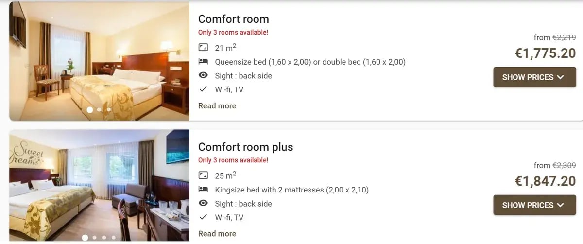
This is an example of what it could look like:

At a glance, you know the differences between the rooms – and see what are the great additional features which the more expensive room offers.
However, if hoteliers don't put the rooms’ key features into the system, they won't show up on the list! On the other hand, if your website allows you to publish longer text strings on the room list, it is definitely not worth making use of it in favour of the key words. Making an effort and putting all the key features into the system will allow you to use them over and over again. Your guests will pay you back with more reservations.
When viewing the room list, guests just want to compare rooms and longer texts will only obscure the picture.
If you cannot dispense with a loose text (because, for example, the rooms have a unique character that has to be shown somehow), the description should not exceed the length limit of one text message: 160 characters. It should more or less look like this:
The key features are not all, of course. The rooms should also be described in a detailed form available on the per room view. This is what you can really do your word-magic. Unfortunately, around 70% of them do not take the opportunity and provide only sketchy descriptions.

How describe rooms?
It is worth repeating the key features of the room, just like on the room list. They should be conveniently displayed at the top of the page clearly visible to guests, so they don't have to spend time searching for the most important features among the remaining features.
What should you start writing room descriptions from?
It is good to start with brainstorming and writing down all information that you think might be of importance and interest to guests. Talk to the reception staff – they know what guests ask about and what arguments influence positive decisions.
Don’t start writing just yet! Let’s first classify room features into three groups - from the most to the least important ones.
The first group should include the features that are good description of your hotel’s unique characteristics and atmosphere. What we mean by it are the distinguishing features that you want to highlight, that make you stand out from other hotels. For example, in the case of a historic building it might be a short (more on what we mean by “short” will follow soon) reference to its history.
The second group is all the important information on room furnishings, amenities and arrangement, and terms of stay (complementary services, range of service, pet friendliness, child policy and cancellation policy) – those are the details that guests ask about.
All other information that does not fit into the two above groups will constitute the third category. It includes descriptions of what guests can see in the photos (“furnished in two styles – classical and modern, in brown and golden tones with green, beige and orange accents”) as well as high level statements (“We aim high when it comes to the standard of our rooms.”).
The information from the first group should be placed just after the key features of the room. You can consider illustrating it with a photo. Then comes the information from the second group. The third group should be omitted altogether – a long description will discourage guests from reading the text.
How to put it all together?
This is of crucial importance. Our research also demonstrates that hotel guests do not read blocks of text. Instead, what works well are short bulleted list, with the most important fragments in bold type, such as this:

Make sure your descriptions are short and to the point. Once a text is ready, make it shorter by a third. Then ask someone to edit and shorten it by another third. Consider every word – does it carry any useful information? Remember that hotel guests don't want to read long and meaningless descriptions.
What about pictures?
Pictures should show what is difficult to describe with words (style, colours, spaces, atmosphere) and vice versa – the lexical description should include all information that pictures cannot convey. Graphics and texts are meant to communicate different types of information and it is worth remembering this distinction.
Do you want to help guests make the decision?
Increase the number of reservations with Profitroom Booking Engine!
Thank you for completing the form
The administrator of personal data is Profitroom SA, we will process the data provided by you in order to answer the request (Article 6 paragraph 1 letter f of the GDPR). (more)
I'd like to know more
* mandatory field
-Mar-11-2025-10-07-16-4716-AM.jpg?width=2000&name=Reception%20with%20Guest_00125%20(3)-Mar-11-2025-10-07-16-4716-AM.jpg)


